The category for this weeks daily creates is data visualization.
For this week’s Daily Creates category of Data Visualization, I asked AI to give me a few prompt ideas that I could create.
- Mood throughout the day.
- I decided to relate this to my multimedia project by rating my positive mood out of 10 at each checkpoint of the hike.
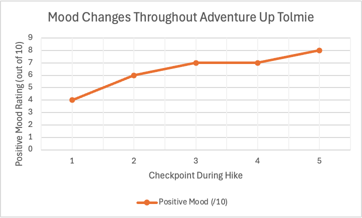
This graph displays how my positive mood changed throughout my hike up Mount Tolmie. Near the beginning of the hike at checkpoint 1, I ranked my positive mood as a 4/10. I was tired after waking up, and was not looking forward to completing the to do list I had made the previous day. As I made my way up the mountain, my positive mood increased and reached its maximum at my final checkpoint. This visualization provides a clear representation of how spending time outside positively affected my mood.
I can apply Mayer’s principles by:
- Removing any unnecessary background colours or decorations to follow the coherence principle.
- Using a clear labels and a descriptive title to follow the Signaling principle.
- Keeping the title close to the graph to follow the contiguity principle.
- How I spend my day.
For this prompt I decided that a pie chart would best display how my hours are spent in a day. This allows for a visual that shows comparison as well. This prompt helped me realize how data visualization can quickly communicate information that is harder to recognize in a written list.
I can apply Mayer’s principles by:
- I kept the chart very simple by removing any unnecessary colours or patterns that could distract away from the concept of the graph. This relates to the coherence principle
- I have clear labels to help viewers quickly and easily understand the graph. This relates to the signaling principle.
- I have a clear and simple title placed about the graph, and the hours corresponding to the activity are placed near the proper section of the chart. This relates to the contiguity principle .
- Screen Time Breakdown.
- I made this data visualization using my phone’s screen time records. I can now see how I spend my time on my phone each day by organizing it into categories. Instead of reading a list of each category, I can use data visualization by putting the information into a pie chart. The pie chart makes comparison of the different categories much easier.
- I can apply Mayer’s principles by:
- Removing any unnecessary colours or decorations that distract away from the message of the chart. This relates to the coherence principle
- Including a clear title and categories to provide the most clear representation of the graph for viewers. This relates to the signaling principle.
- Placing each category label next to the corresponding section of the pie chart to make it as understandable as possible. This relates to the contiguity principle.
- Using my own screen time statistics to make the chart more relevant and meaningful rather than using made up data. This relates to the personalization principle.
Leave a Reply
You must be logged in to post a comment.